
Our Dutch colonial kitchen remains in mid-redo,
or as I like to call it — “that awkward stage” —
see also: ME, in 7th grade. Ha!
While I’ve matured from “awkward” all the way to “granny” . . .
. . . our poor kitchen still looks a tad iffy!
Fear not!
There have been lots of improvements!
Check out this wonderful, new trim around our wonderful, new window:

People, I can’t over emphasize how awesome this is.
When I say new window, I mean it.
Check out this before snappie:
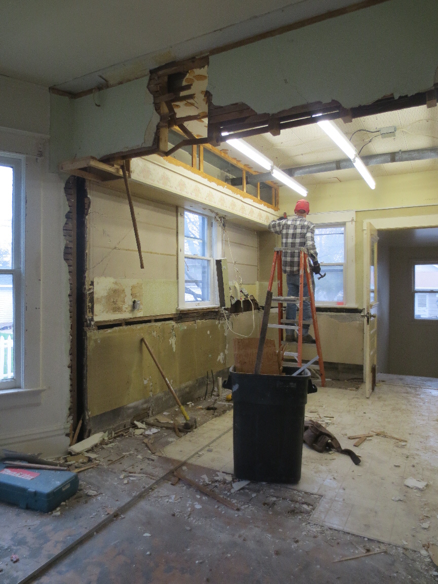
Here’s a during photo, showing a much larger new window:

And now:

G.O. masterfully reproduced our Dutch colonial’s original window trim
+ then gave it a couple coats of fresh, white paint.
Now it’s impossible to tell that it wasn’t always there!
 .
.
Look closely, + you can see another improvement — bead board walls.
The kitchen needed them, for instant charm + character, don’t you think?
But wait!
It’s not paneling; it’s actually paintable wallpaper!
Martha Stewart from Home Depot.
$24.95/roll

It’s already been painted a very pale gray —
Thin Ice from Pittsburgh Paints.
There it is with the rest of my kitchen color story:

At left is our kitchen ceiling’s Chambray blue,
also from Pittsburgh Paints.
The white represents the woodwork + cabinets,
+ the dark gray was* chosen for the doors
(*I’ve since opted to go darker, though, so stay tuned.)

Yikes! That door really needs a fresh coat, no?
And the naughty, obviously bad-replacement door hardware?

It will soon be replaced with this —
our house’s beautiful, original hardware!


Much, much better, no?
Looks like I need to go shopping for a new cat door, too . . .
. . . more on that, later.
* * *
Anyway, back to the color story!
There’s yet another gray — that of our fabulous backsplash tiles:

My mostly-gray color scheme is very subtle, ’tis true,
but there will be enough contrast to make things fairly interesting.
I hope.
Fingers crossed!
* * *
So. Let’s recap, shall we?
1. Gray walls are slightly darker than white woodwork.
2. Gray backsplash tiles are slightly darker than gray walls.
Check, check!

Oh, + did I mention that today, at long last,
the kitchen floor tiles are being installed?


The operative words are at long last,
so imagine my excitement about that floor!
In fact, I must step away from the bozoputer + head over, to view said-same!
Stay tuned!

February 17th, 2015 at 4:34 pm
Wow, was the original door hardware squirrelled away somewhere in the house? And the window lokks perfect. Good job GO.
February 26th, 2015 at 3:57 pm
HA @ ‘squirrelled away” — something I’d totally say! I asked G.O. the origins of this door hardware, + he said that it was on an old door that we eliminated in our re-do. Probably the bathroom. TY for reading + commenting!
February 18th, 2015 at 12:26 am
LOVE all the natural light you’ll be having in your kitchen! Awesome is the word!
February 18th, 2015 at 2:58 am
Dolores, affirmative on our house having oodles of sunshine! That’s one of the reasons I loved it so! Have a swell rest of the evening!