
Good things come to those who wait, no?
Well, that’s always a plus when you’re me,
because it seems like I’ve been waiting FOREVER
for this bad enclosed front porch to go away:


So close! It’s almost gone here!
I have a vision, of course, thanks to our beloved internet.
(What DID we do, back in the olden days
before the bozoputer, one wonders?)
Anyway, this is what I have in my head, Dutch-colonial-front-porch-wise:
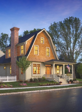
Houzz.com
Don’t you love it? So charming + inviting!
Anyway, last week, the guys finally removed our naughty porch enclosure.
Drum roll!
Here ’tis now!

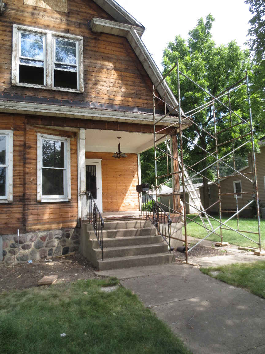
Much bettah, am I right?

But check out that light fixture!
It’s a nice enough Craftsman-style charmer, I guess,
+ I s’poze it would look pretty cool, hanging above someone’s dining table.
Just not my front porch!
Never fear.
Here is our cottage-y replacement, waiting in the wings:

Pottery Barn
Of course, I’ve already pleaded with G.O. to take down that dining room light mishap.

Having ‘a blast’ at the Steely Dan concert.
But get this!
He insists that he has other, more pressing tasks, than taking down a bad light fixture!
How’s that possible!!??

Obviously, unlike me, HE is not mortified by the idea that passersby
might think we WANT that dining room light hanging on our front porch!
HA! Imagine that!
* * * * *
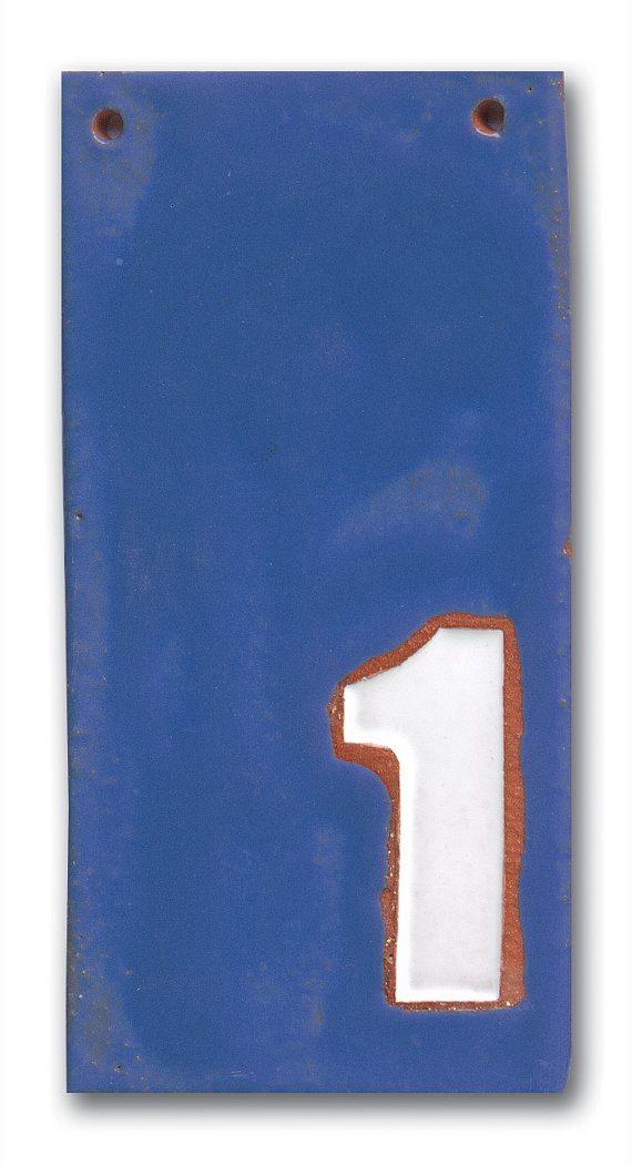
On a related (sort of) topic, of course I’m already shopping for house numbers.
You see, they’ll go ON that front porch, eventually.
What I really want is a European-style enamel sign like this:

Something in Frenchie blue, perchance?

Love it! Done!
Pass me my credit card + get out of my way!
* * * *
But wait.
Just in case there’s something even cooler out there,
I’ve been shopping on etsy again.
Look what I found, from a cool shop called Claysquared:
http://www.etsy.com/listing/158604427/modern-flat-house-numbers-frenchy-blue
HA! How awesome is it, that they refer to the color as “frenchy” blue?
Is it just me, but aren’t these a modern version of the more vintage enamel signs?
What say ye?
This choice — between vintage + modern —
describes my design plan for our entire re-do.
Vintage

Vintage-inspired modern
Now that I think about it, it seems all my choices, so far, are of the vintage persuasion.

Would modern stuff be cool or hopelessly out of place?
One wonders?

August 6th, 2013 at 1:55 pm
looks great. i am extremely jealous. i dream of a front porch.
August 6th, 2013 at 5:36 pm
Hola Traci
TY for the kind words! That porch is so awesome; it’s huge, like an aircraft carrier deck! 😉 Now I can’t wait to trick it out with white spindles + stuff!
Sincerely,
K A Y
August 6th, 2013 at 5:21 pm
First, let me just say that I love your posts. And that I am looking forward to more, especially the interior progress. Don’t get me wrong, the exterior is a neat work in progress. But, back to house numbers, I think the cottagey way looks better, as in the single placard. Just my humble opinion. NancyN
August 6th, 2013 at 5:35 pm
Hola Nancy
Hey, there! TY for the compliment! You’re not the only one who is anticipating more interior progress! 😉 I agree that the Frenchie enamel sign would look the best, as our exterior is going to be quite cottage + traditional. Besides, I love anything that looks like it’s French! I may or may not order 3 of those modern clay tiles for the garage (in the alley) or the future back fence gate. TY again!
Sincerely,
K A Y
August 6th, 2013 at 9:24 pm
I DO love what your porch is becoming!!
August 6th, 2013 at 9:36 pm
Hey Dolores
This is one of those rare instances where something you envision is going to look even better than in your dreams. At least, I think so. Good X’s! TY for the comment! It means a lot!
Sincerely,
K A Y
Fun Seeker